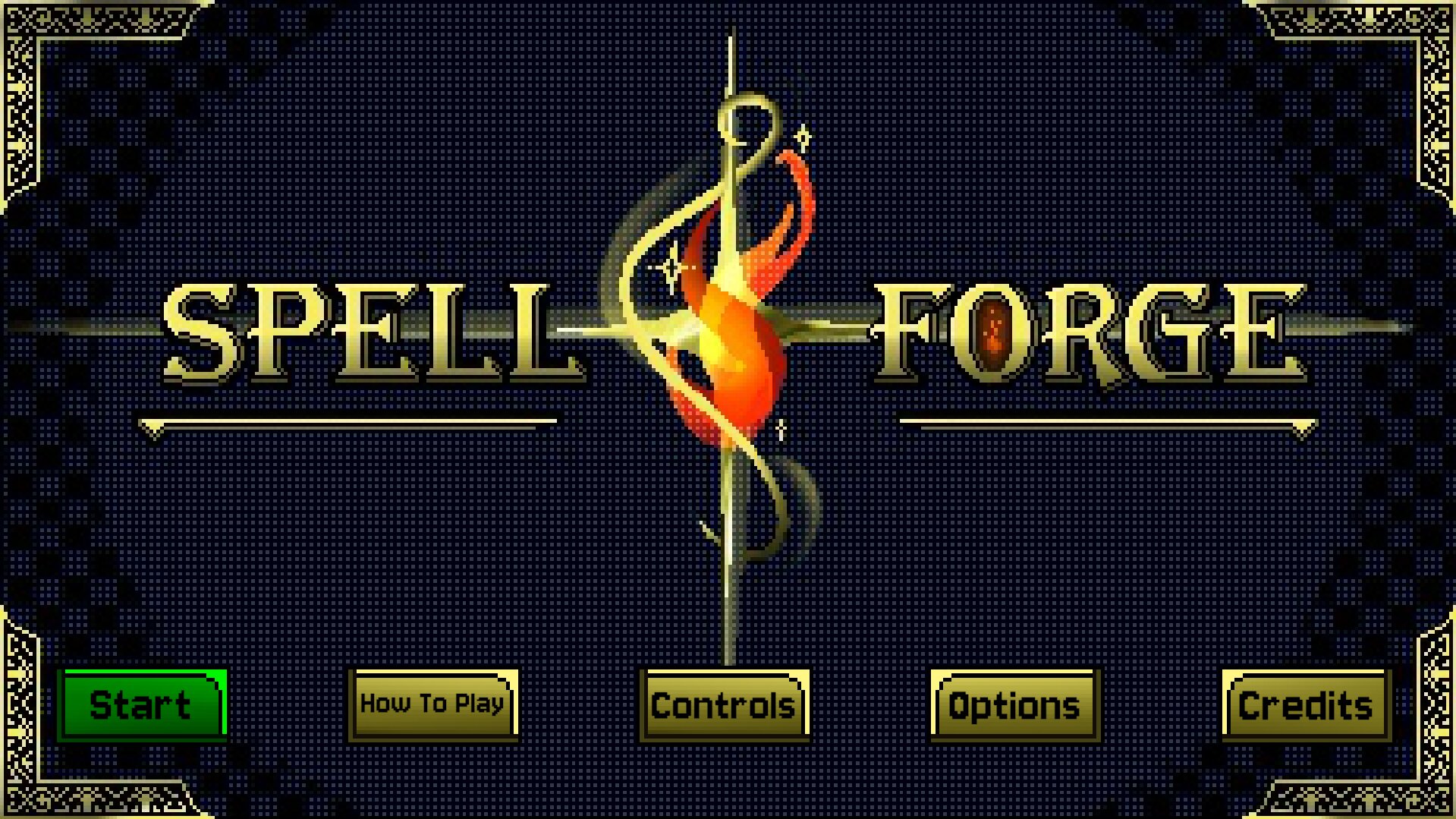
Spell Forge
Producer Goal
Lead a Small and Nimble Team and Play to Everyone's Strengths
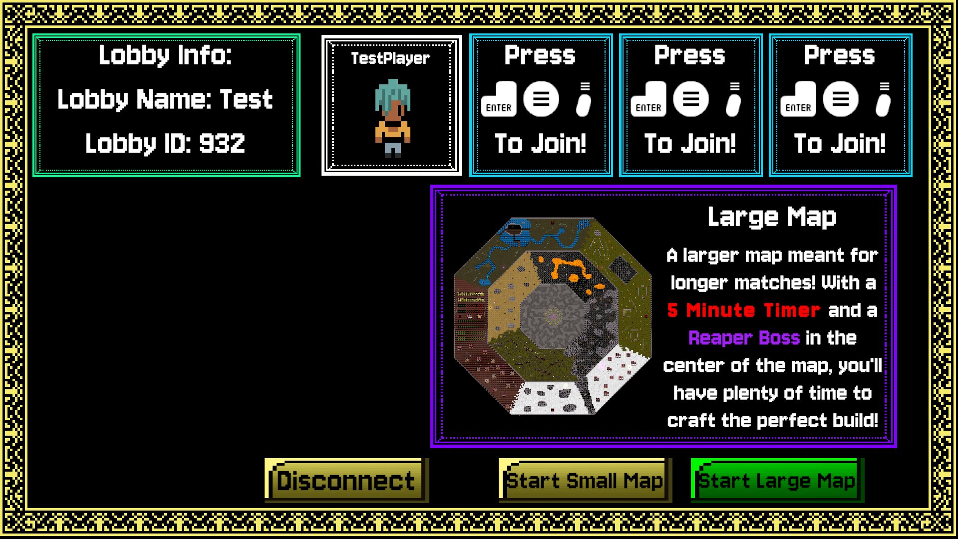
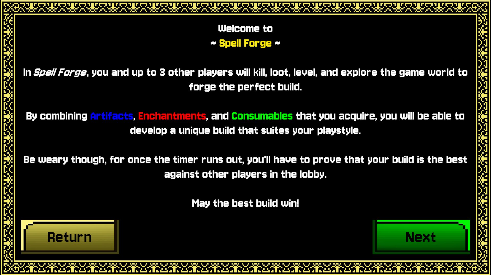
Spell Forge is an ambitious project for a small team of 7. Full deterministic physics utilizing Photon Quantum, 2 Massive Maps with hordes of enemies and a final boss, PvPvE Spellcrafting gameplay inspired by Noita with a final BuildvBuildvBuildvBuild battle at the end, 14 Unique Primary Artifacts and 12 Enchantments that can stack and augment them, and a Retro Aesthetic along with so much more. Granted, while I didn't expect the game to have this content when I first joined the project, I always knew from the beginning that I was going to have to keep this team nimble and utilizes everyone's strengths to optimize our efficiency. These exact traits and ideas are why I was chosen to be a Producer on this project according to my own professor. However, there was one hurdle I had to overcome...
Being a Producer and Expanding the Team on a Project Where Half of the People Have Been Working Together on it for a Month Already
This hurdle is the one that I was most worried about, and it's a hurdle I overcame quickly. Due to my prior work experience with my team members, I was able to integrate smoothly and help the team grow without disrupting the existing dynamics. By also talking to and understanding the development of certain aspects of the game for Disciplines I don't consider myself a part of, like Art, I was able to create and manage tasks efficiently and keep the project on track.
I also utilized Trello, Miro Boards, Waterfall Methodology, Discipline Meetings, and created a project-and-discipline-wide Asset List to help everyone on the project stay on track and know what tasks to prioritize. This was especially helpful when the Main Design of the Game had to Pivot to Something Else.
Making a Massive Pivot - Producing and Design
The Realization
Prior to my involvement in the project, Spell Forge was a very simple game. Each player was on their own copy of the single small map, they killed enemies, collected up to 1 artifact and enchantment, and then fought each other with those in the final battle once the game timer expired. The previous team made the decision that the game should increase in complexity in order to make it more replayable.
Upon joining the project in the early summer leading up to a semester of development, I worked with the team and the other Designer to come up with how we could increase the complexity of the game while still keeping close to the game's core vision, PvP Spellcrafting. Our solution was in-match minigames, such as Capture-the-Flag, Hot Potato, King of the Hill, etc. With inspiration from Kirby Air Riders we believed we were on the right track and we worked on these modes during the summer. However, when the semester started and we started to get feedback on it, we realized that while we did increase the game's replayability, the core player gameloop was still too simple and not engaging enough for prolonged play. Upon realizing that we added more content to a foundation that was too simple, we scrapped our entire summer work and started back at the beginning.
Redesigning Core Gameplay
With this massive setback putting us behind our original semester-long schedule, the other Designer and I had to quickly come up with the new core design of the game and I had to plan out the rest of the semester with the team. After deliberating for a while and doing tests, we decided to take inspiration from Noita and its Spellcrafting system which then expanded into the game that Spell Forge is today (as explained at the top of the page)
The Result and Reflection on the Pivot
People loved the game. While its complexity did take some getting use to, the issue with the original design was solved and the game turned out how we all wanted to be. As a Producer, I was thrown into a situation where I had to manage a pivot that could have been disastrous for the project if it didn't succeed, but by working with the team and communicating with them, we were able to make the pivot successful and we ended up with a much better game because of it.
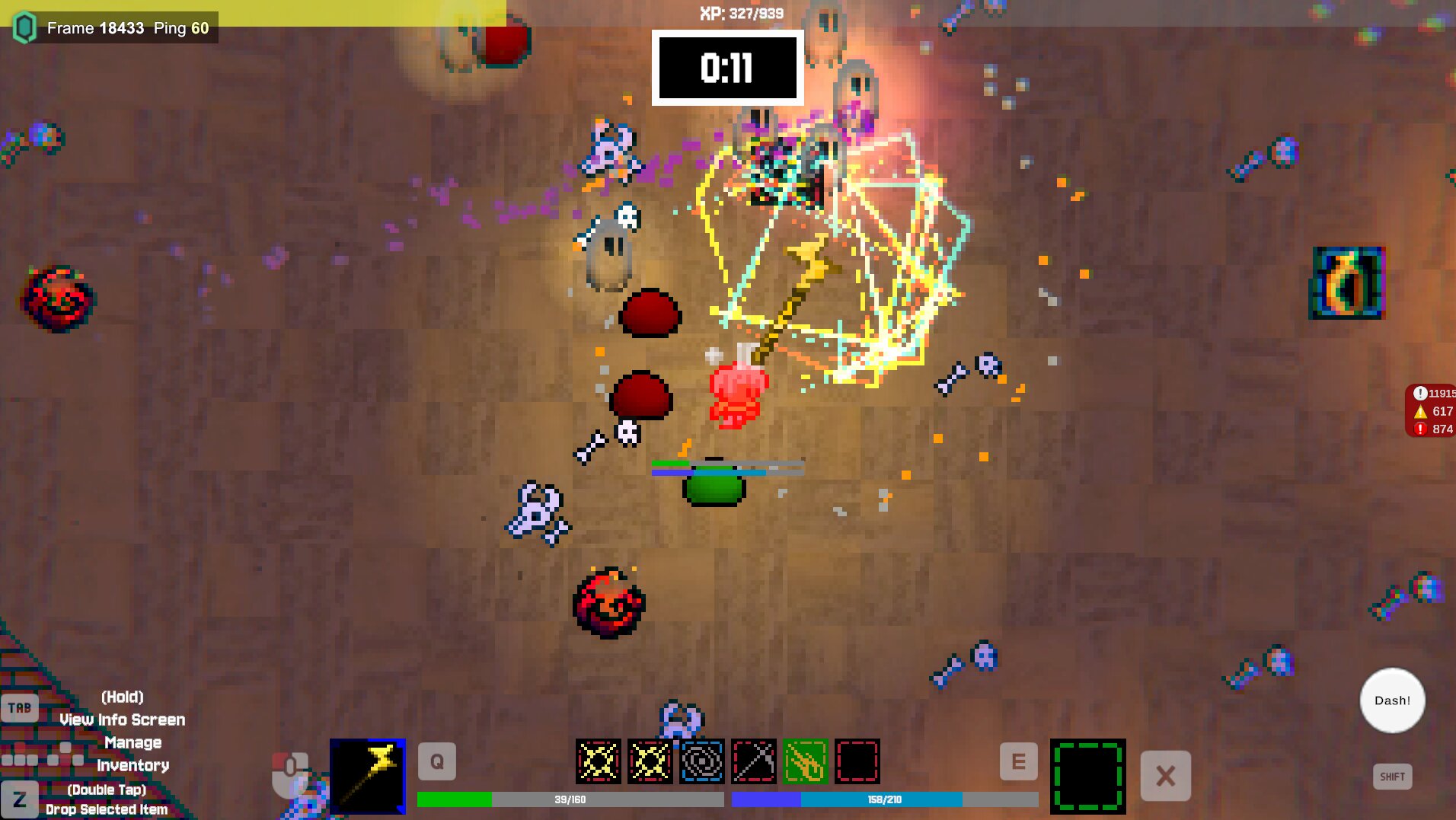
Camera Effects
Convey Valuable Information with the Camera
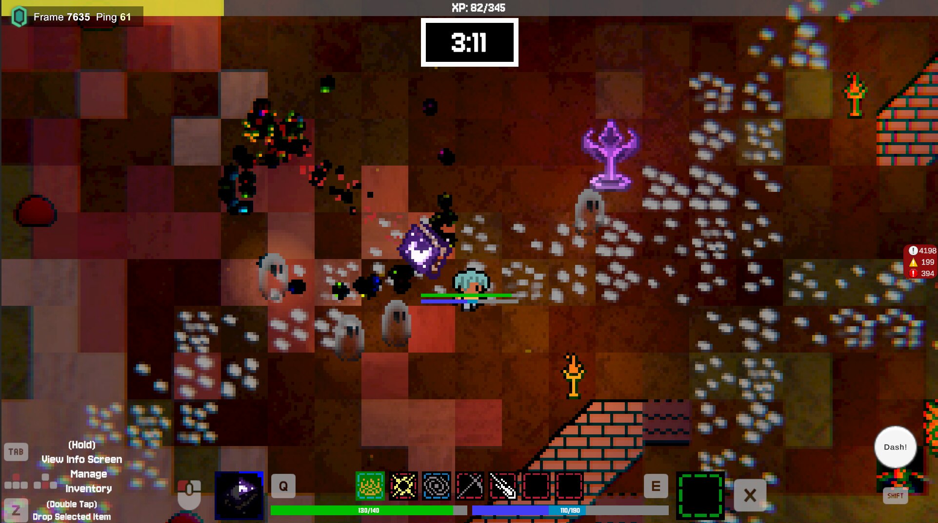
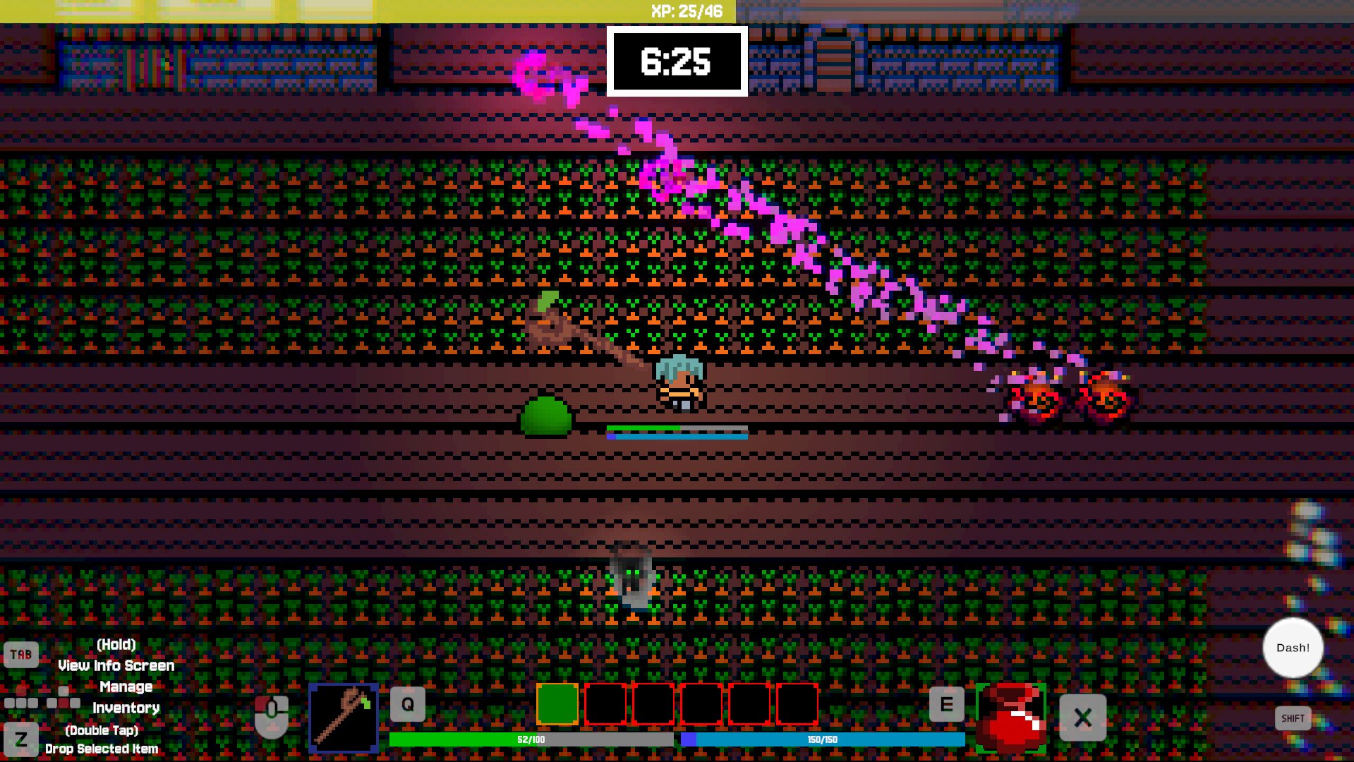
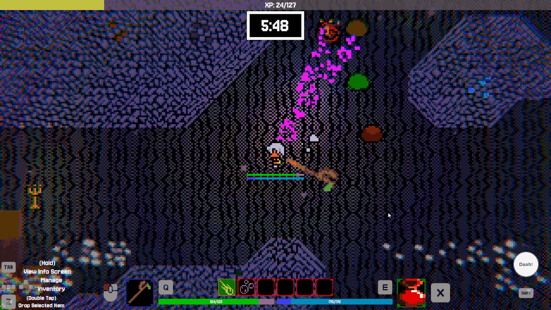
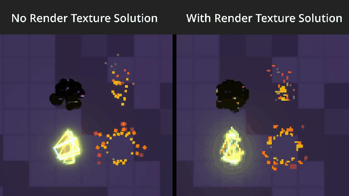
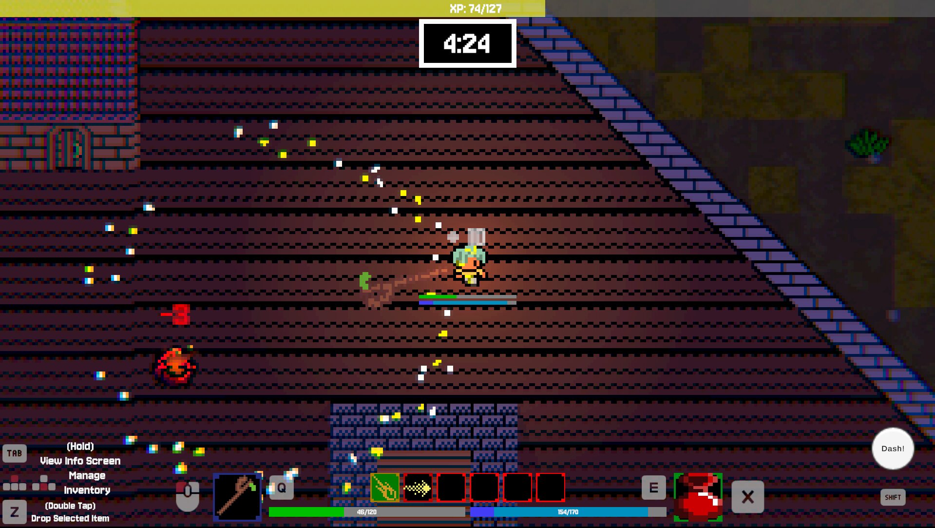
With so much happening on the screen and what the player had to focus on, we noticed that sometimes the player would not be able to tell when they were taking damage or when an explosion was nearby (we did have the player flashing red, but that functionality broke on the last day of the project).
Solution - Convey Information with the Camera
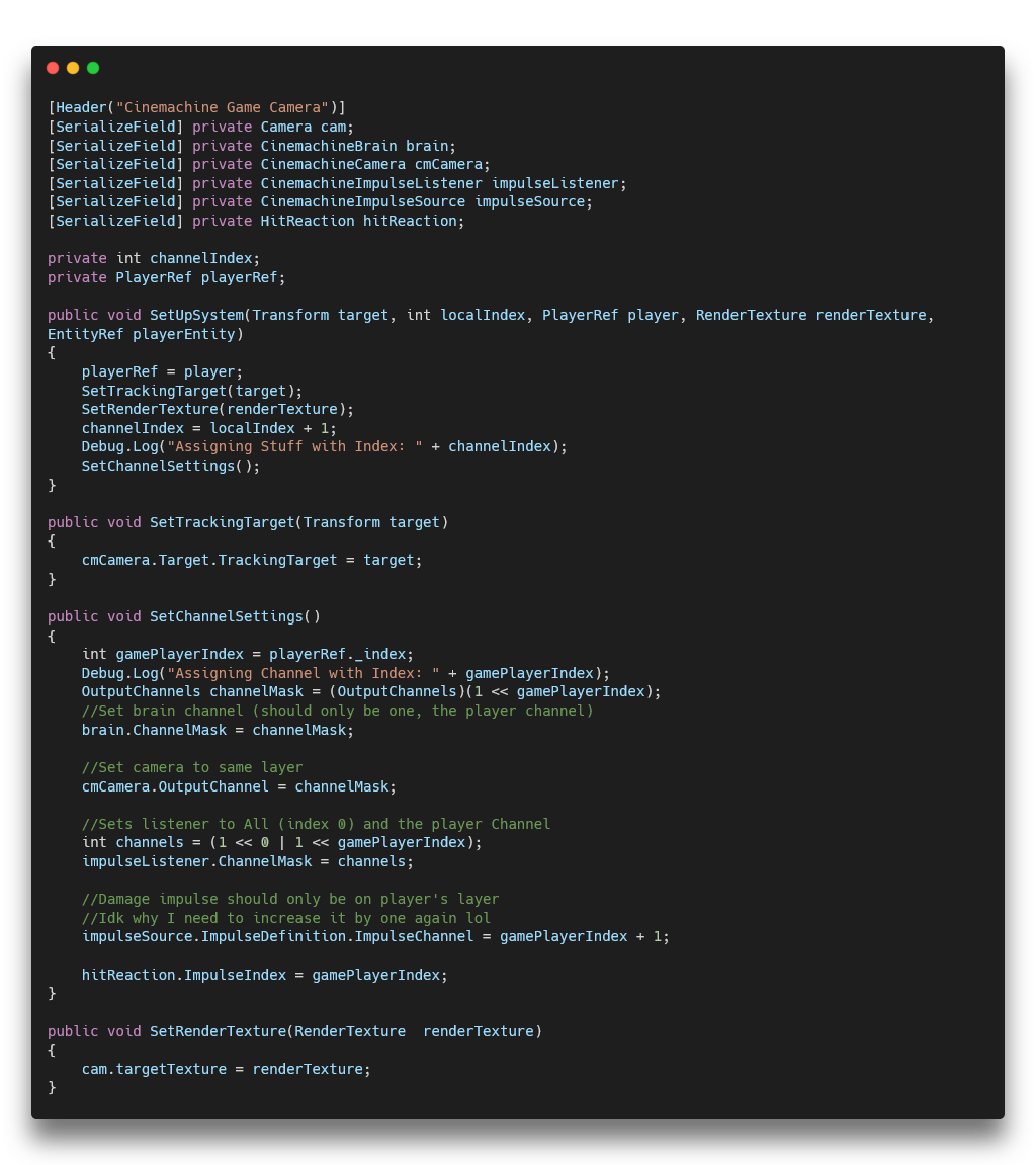
By switching the camera over to Unity's Cinemachine Camera System, I was easily able to add in screen shake for player damage and for nearby explosions (with falloff!). This used Cinemachine's Impulse Source and Impulse Listener components to great effect. Each player, both locally and on online, were assigned a special index and put on a special channel. So, when they took damage their character would send out an Impulse Source and their camera would react to it via Impulse Listener. With explosions, a Designer would just need to have it broadcast an Impulse Source on all channels and, due to falloff, only players close enough to the explosion would have their camera react to it. This greatly reduced player confusion and resulted in them becoming more knowledgeable about their current player state.
This system also allowed me to utilize Render Textures too in order to enhance the VFX of the game that I made, which can be seen in more detail here: Spell Forge VFX
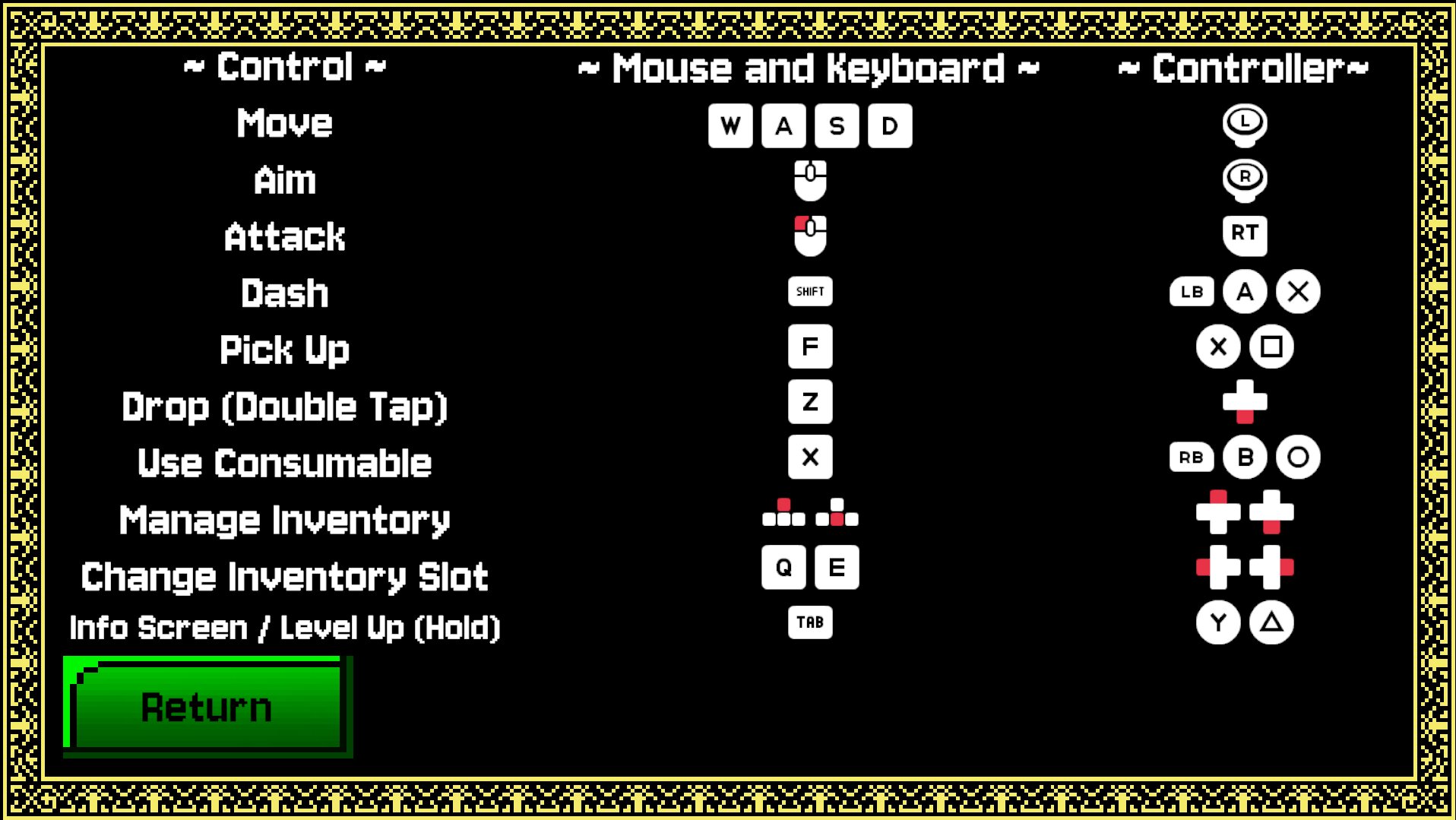
On-Screen Controls and Dynamic Glyphs
The Problem - Forgetting Controls
One issue found while playtesting the game was that players were having a hard time remembering what button did what, especially with inventory navigation. This was especially a problem for new players who hadn't had the time to learn the controls yet. We needed a way to help players learn the controls and remember them during gameplay without having to pause the game and look at a control scheme or something like that.
The Solution - Dynamic On-Screen Controls with Controller Glyphs
While the solution does make the game's UI more cluttered, it greatly improves the player's ability to learn and remember the controls. By dynamically displaying the correct controller glyphs based on the player's input device, we ensure that the information is always relevant and easy to understand.
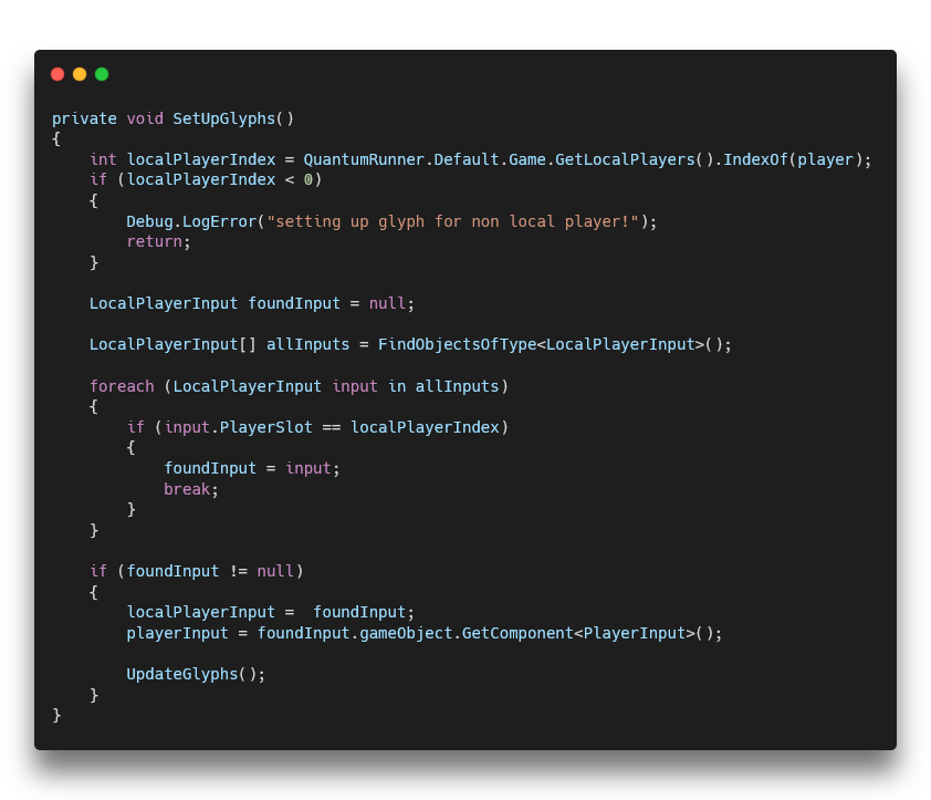
How I Did It
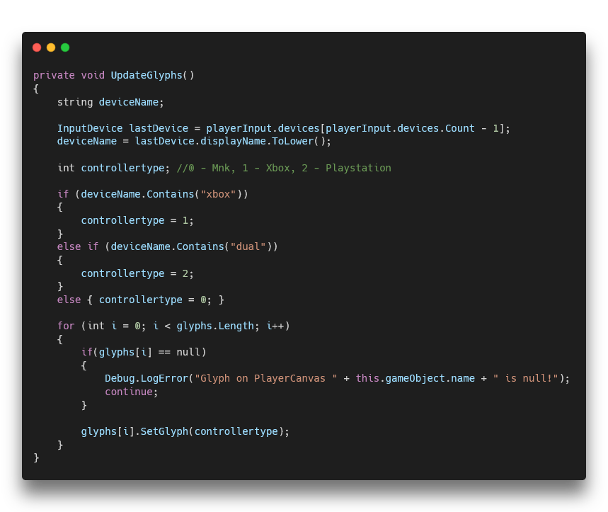
I accomplished this by attaching two functions on our PlayerCanvas script which handles the player information and then a single script that is on the Glyph object itself.
Essentially, SetUpGlyphs() gets the PlayerInput component for the desired local player index and the call UpdateGlyphs().
This function gets the current controller's name and then tells every Glyph what it is. I took great care in researching the internal name of every controller (specifically Playstation) so that any Xbox and Playstation controller would work.
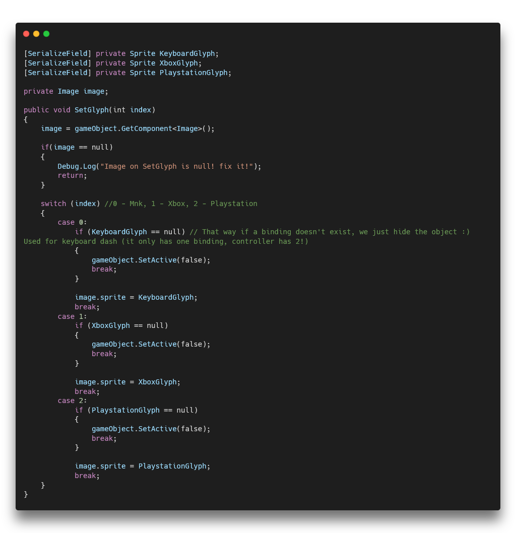
Then, the Glyph script with SetGlyph() takes that information and changes the Sprite of the Glyph to the correct one based on the input device. I also designed it in such a way that some glyphs only popped up if they were needed. For example, Dash only has one binding on keyboard but two on controller, so the extra glyph is hidden when using Mouse and Keyboard.
Result
This had an immediate positive effect on players' ability to learn and remember the controls. It also made the game more accessible to new players who may not be familiar with the controls yet which resulted in them giving us better playtesting feedback.
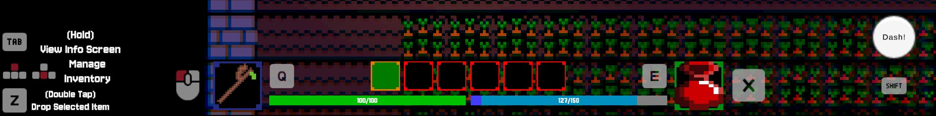
Mouse and Keyboard Glyphs
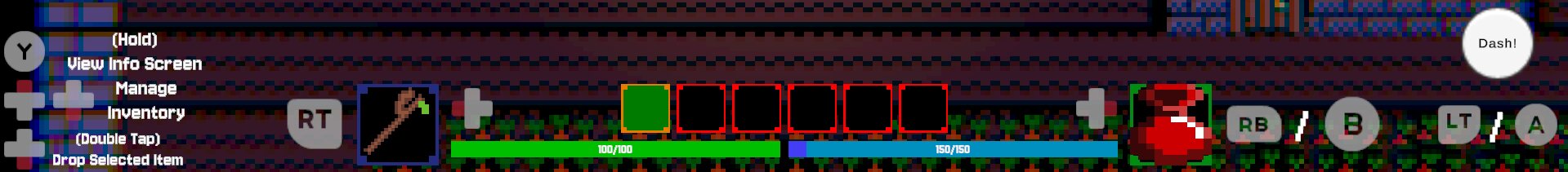
Controller Glyphs (Playstation has Playstation Buttons)
UI Design - Clean and Accessible During Split-Screen
My Vision
As the sole UI-Designer, my goals were the following:
- Design a Clean and Minimalistic UI
- Make Sure the UI was Accessible and Readable During Split-Screen Gameplay
- Limit the Places the Player Needs to Look At
- Ensure that the UI was Able to be Easily Modified by Programmers if Needed
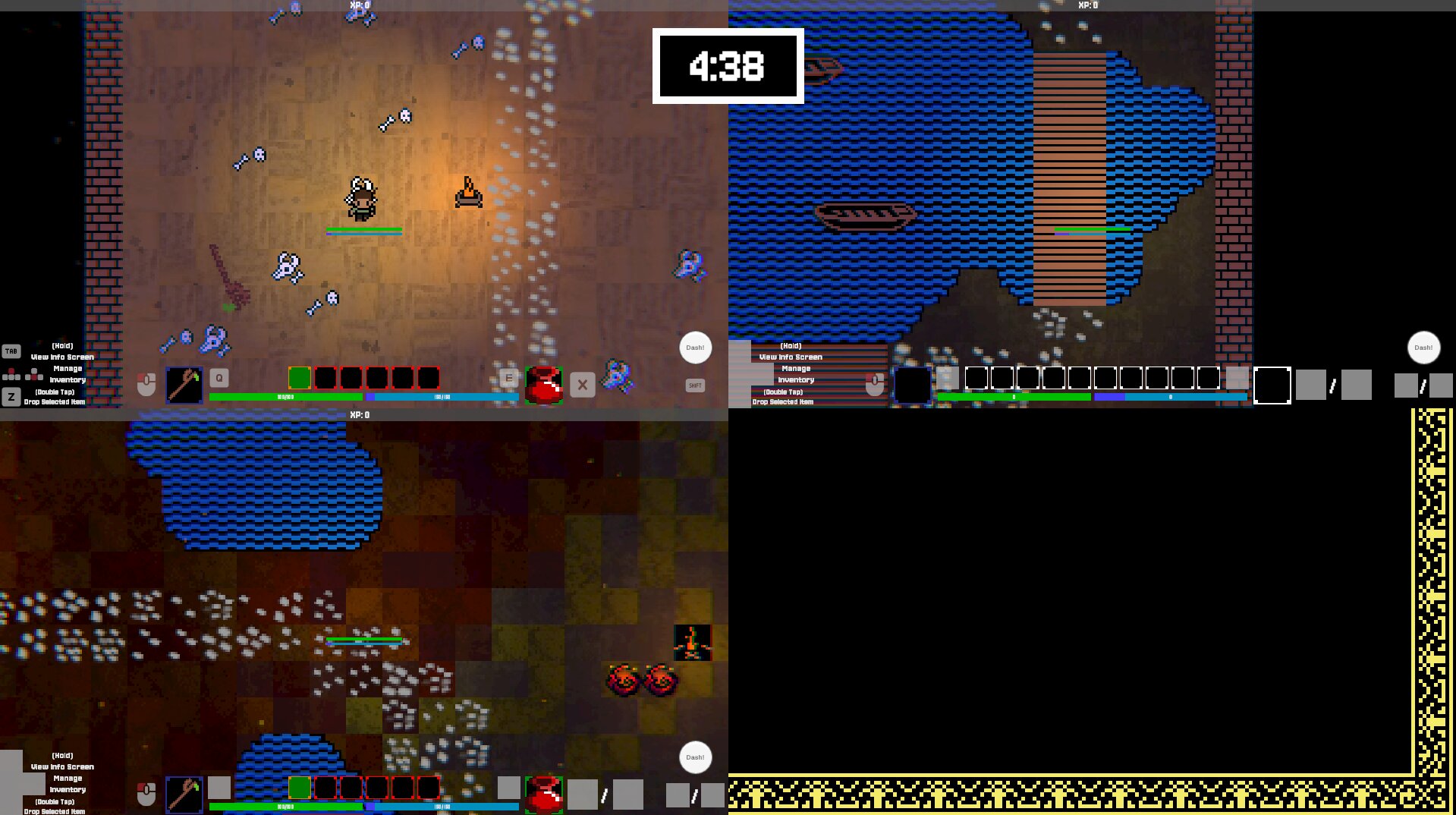
With the In-Game UI, I decided to show the important information near the player with further detail being at the bottom of the screen. This can be seen with the health and mana bars by the player.
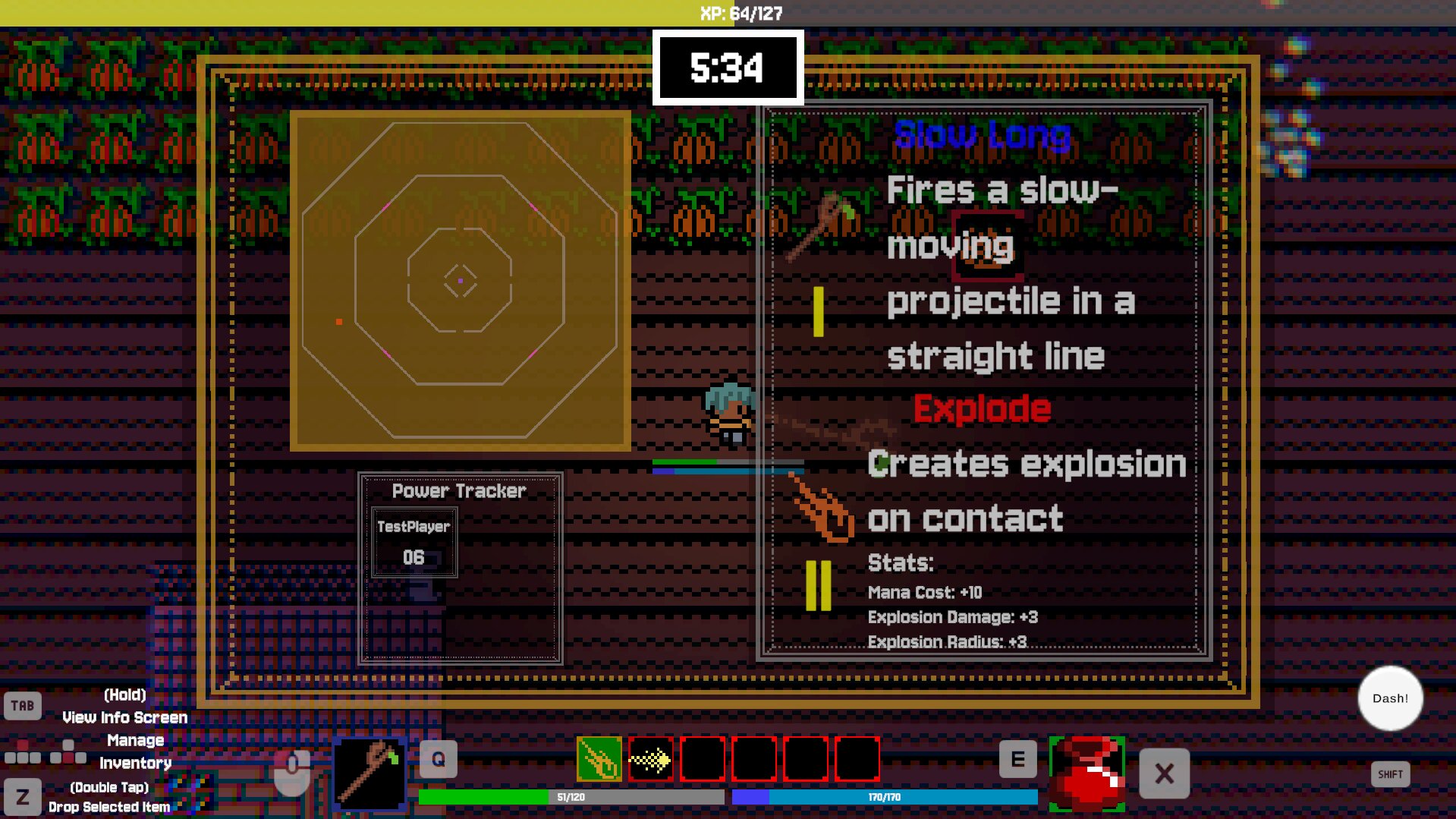
With the Info Screen UI the goal was to show only information that couldn't fit on the in-game UI so that the screen wasn't cluttered. Here, the player can see the minimap, the power level of every player in the game, their current artifact and description, and the currently selected enchantment and its description and stats. The screen was kept semi-transparent so that players could still see the game and be aware of what was going on while they were looking at the info screen. It should be noted that this screen is not meant to be seen that much during gameplay. It's meant to be a quick glance and that's it. Hence why its items are pretty large.
The big challenge with this UI was keeping it all readable while playing locally with up to 3 other players. So, this resulted in me having clear shapes and having UI elements be large so that it is visible even when the screen is split into 4. I also made sure to use color and contrast to make sure that the UI stood out against the game and was easy to read. I took heavily inspiration from Minecraft's UI for this as it was proven to work well.
In the next section, you can see some of the other UI layouts I designed for the game.
Project Reflection
Producer
Spell Forge was my biggest test as a Producer. I was joining and expanding a team that already had a dynamic to it, the whole game's Core Design changed which caused a summer of work to be scrapped, and I had to manage a team of 7 people to make sure we stayed on track and made the best game we could. It was a very challenging experience but I learned so much from it and I'm proud of what we were able to accomplish as a team. I learned how to be better at managing tasks, how to keep team dynamics, how to give people ample time for a task, and how to cut back to have a polished solid core experience. This game could have easily ballooned into being something unmanageable as a team, but it didn't.
Design / Programming
I had to dive deep into UI Design and Programming for this project in order to ensure a polished and immersive player experience. I had to learn how to layout UI to make it readable at a glance, I had to learn to control where the player should look, I had to add QoL features to make the game more accessible, and I had to dive a little bit into Networking Programming to ensure that my features worked online as well as locally. My biggest goal was to have the game be able to picked up, played, and understood by anyone. It's a party game after all, and that casual pick-up-and-play experience is what I wanted to make sure we had. I believe that I accomplished that with the UI and the on-screen controls, and I think that those features really made the game stand out and made it more enjoyable to play.
Getting Playtesting Feedback
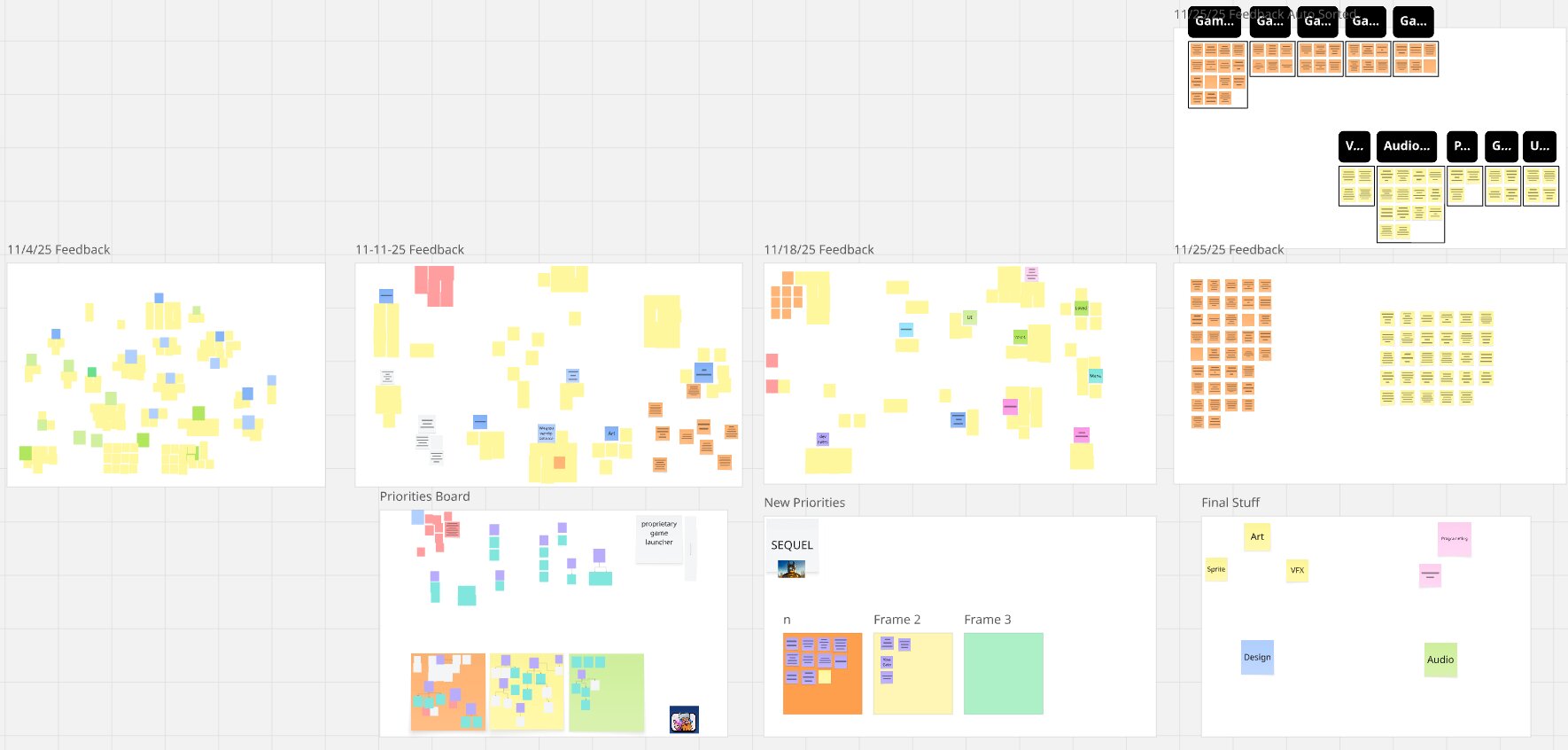
I also learned how to get good playtesting feedback and how to utilize it well. During a playtest session, the team and I would take constant notes on what players are saying, doing, and how they are acting emotionally. We would then compile these into a Miro board and categorize them based on what aspect of the game they were about and how urgent they were. This allowed us to easily see what issues we needed to address and what we could wait on. It also allowed us to see what players were enjoying and what they weren't which helped us make informed decisions about what to focus on during development to great success.
Overall
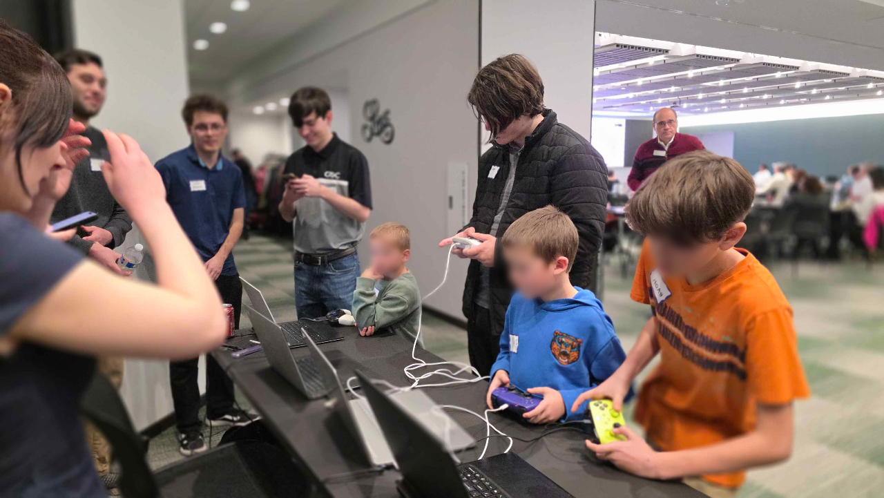
The project was a success. It was demoed at Lansing Demo Camp where we had a lot of people play and give us positive feedback. We even had these 3 really young boys who played the game for pretty much the whole time of the event. They weren't our target audience nor where they paying much attention to the Spellcrafting, but they still managed to have fun.
Overall, we made a game that we were proud of and that players enjoyed. We overcame a lot of challenges as a team and I learned a lot from the experience. I'm grateful for the opportunity to have been a part of this project and I'm excited to see what I can do in the future with the skills and knowledge I gained from this project.